

Organization settings —> Appearance and you can update any and all of your default colors used in your organization.
Viewing available palettes
You will see a list of color palettes that you can choose from for each mode. You can create your own palette by clicking on theAdd new palette button. Here you can preview the palette before you save it.
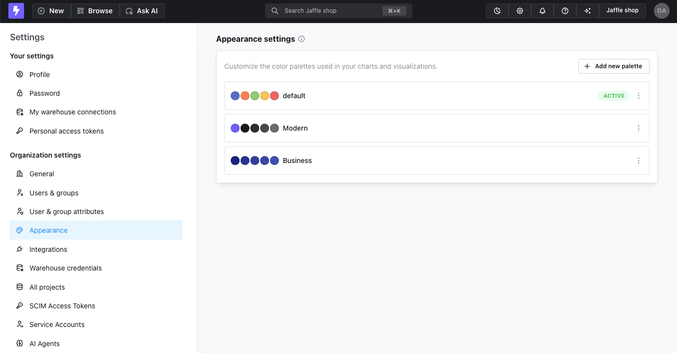
Color palettes for light and dark mode
You can configure different color palettes for light mode and dark mode to ensure optimal contrast and readability in each theme. The appearance configuration includes separate tabs for both light mode and dark mode, allowing you to customize color schemes for each theme independently.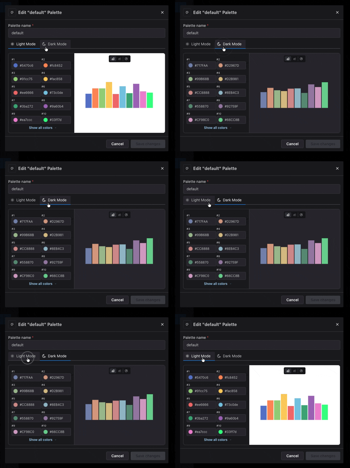
Set the palette as the default
Once you have created your palette, you can set it as the default palette for the current mode (light or dark) by clicking on theUse this theme button.
You can always come back to this page to change the default palette.

Color palette hierarchy
Palettes themselves are always managed at the organization level, but you can pick a specific palette at lower levels to override the default. When a chart is rendered, Lightdash resolves which palette to use by walking up the following chain and stopping at the first override it finds:- Embed / SDK — when a chart is rendered through an embedded dashboard or the React SDK, a palette passed in via the embed token or SDK config takes precedence over every other level, including a per-chart override. See Embedding with React SDK — Color palettes.
- Chart — a per-chart palette set from the chart’s Series tab (cartesian and pie) or Steps tab (funnel).
- Dashboard — a palette set on the dashboard from its settings modal. Applies to all tiles in the dashboard unless an individual chart overrides it.
- Space — a palette set on a space. Nested spaces walk up through their parent spaces, so a child space inherits its nearest ancestor’s palette before falling through to the project.
- Project — a palette set on the project from
Project settings—>Appearance. Applies to every chart in the project unless something below overrides it. - Organization — the organization’s active palette (set on
Organization settings—>Appearance). This is the final fallback.
Setting a project-level palette
Project admins can pick one of the org’s palettes for a project underProject settings —> Appearance. The picker is read-only — to add or edit palettes themselves, go to Organization settings —> Appearance. Charts in the project use the project palette and fall back to the org’s active palette when none is set.
Setting a space-level palette
When creating or editing a space, you can pick a palette underneath the space name. The palette applies to every chart in that space and to any nested spaces below it that don’t set their own palette. If you leave it unset, the space inherits from its parent space (when nested) or from the project.Setting a dashboard-level palette
Open the dashboard settings modal to pick a palette for a dashboard. Tiles in the dashboard render with the dashboard’s chosen palette unless the chart itself sets a per-chart override.Setting a chart-level palette
In the chart editor, the palette picker is at the top of the Series tab (cartesian and pie charts) and the Steps tab (funnel charts). The preview reflects the staged palette before you save; the override only persists when you click Save changes.Brand appearance
UnderOrganization settings —> Appearance, organization admins can also configure a Brand appearance for the org. This stores your brand’s domain, logos, fonts, and colors alongside the color palettes above, and drives branded UI surfaces in Lightdash.
Brand appearance relies on a Brandfetch integration to detect a brand from its domain. On Lightdash Cloud this is configured for you. On self-hosted or OSS deployments the section is hidden until the integration is configured on the instance and a brand has been fetched. The
hasBrandfetch flag on GET /health indicates whether the current instance can detect new brands.Editing your brand
OpenOrganization settings —> Appearance —> Brand appearance. You’ll see a form containing:
- Domain — your brand’s domain (for example,
ecom-store.com). Used as the identifier when fetching brand information. - Colors — the palette detected for your brand. Each color has a hex value and a classification:
brand,accent,dark,light, orother. You can add new colors, remove existing ones, edit a hex value, or re-classify a color. - Fonts — the title and body font families associated with your brand. These are shown as read-only for now; a font picker is not yet available.
- Logos — the light and dark logos for your brand. Logos are populated by the Brandfetch integration only — direct logo upload is not exposed in the UI.
Refreshing from Brandfetch
Next to the domain field is a refresh icon. Clicking it calls Brandfetch for the current domain and replaces the form with the freshly detected brand without persisting anything — you can review the change and either keep it (by saving) or discard it (by reverting).- The refresh icon is grey when the domain has not been edited and blue when it differs from the saved brand.
- The fetch is fully revertible up until you click Save changes.
Saving and reverting
Any edit — including a Brandfetch refresh — opens an Unsaved changes footer with Revert and Save changes buttons. Nothing is persisted to your organization until you click Save changes. Revert restores the last saved brand.Live preview
Alongside the form, a minimal app-window mock previews how your brand will look in Lightdash:- The nav bar renders in your primary brand color with your current logo.
- A sample dashboard title and description use your configured title and body fonts.
- Sample charts are drawn with your brand colors.
Brand API endpoints
The brand appearance settings are backed by three endpoints under the organization API:
Example — fetch a brand for a domain without saving: